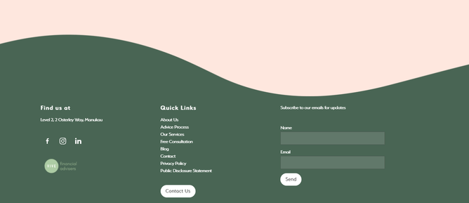
We absolutely vibed with Vive and this website design. It definitely brightened up our lockdown seeing this one come to life.
Vive are the people you NEED to go to for insurance and financial advice. Epic humans who can explain all that 'stuff' that we should have been taught in schools.
When they came to us they wanted a big of a re-vamp on their current website. They had a lot of good info, but it didn't POP how they wanted to.
Colours
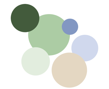
When selecting a colour pallet for your brand it is vital not only because of human psychology but because it is key to what your brand is trying to communicate.
The colours effect how your clients or customers are going to feel on an emotional level, and on a marketing and business level it is important that you stand out in the market.
Finance & insurance has the stigma that is has to be boring, and they wanted to steer clear of that. They came up with a rad colour palette which created a fun but still professional theme for us to follow throughout their whole site.
Shapes
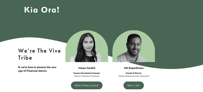
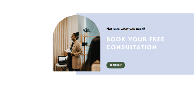
We also used shapes along with the colour palette to really give the friendly and approachable aura that Jith and Maaru give off themselves. They are genuinely two of the coolest, easiest people to speak to and absolutely no judgement whatsoever. It can be awkward talking about money (especially when you don't really know what you're doing with insurance etc) and they make you feel totally okay!
We can't wait to see these guys grow and are stoked to be doing it along side them! Bonus - we get to work with them everyday in our co-working office ;)
You're on the right track if you're talking to them - trust us!
Check them out here.

