
It wouldn’t be The Renew Room – if we didn’t talk about a rebrand!
It is happening all the time, with all businesses (sometimes without you even realising). It can be as simple as changing a logo, updating a font, or adding a colour to your palette. It doesn’t even have to be visual, it could be a change of values, or even just a slight change in tone of voice.
If a business is a well-known company, and they dramatically re-brand - they will let you know. Otherwise it will happen before your eyes and you won’t even notice. It doesn’t have to be a massive change, it can be subtle. But a rebrand keeps your business current & also helps bring a whole new feel to the business both internally & externally.
In this blog, we are going to delve into a big business rebrand & a small business rebrand to compare why they have done this and the potential effects it may have.
First up, NZ Post!
These guys are one of the longest serving postal services in NZ. You probably see them everyday, whether it be in ads, on the road, or when they are dropping off all of that online shopping you’ve been doing (some more than others…woops!).
Have you noticed they have had a visual refresh?
The reason for their rebrand was to unite all of their postal services (Courier Post, Pace and Rural Post courier services). When you have multiple brands under one business it can be confusing for a customer. Having everything cohesive under one umbrella brand creates better brand recognition - with one look for all businesses.
Let’s start with, the logo.
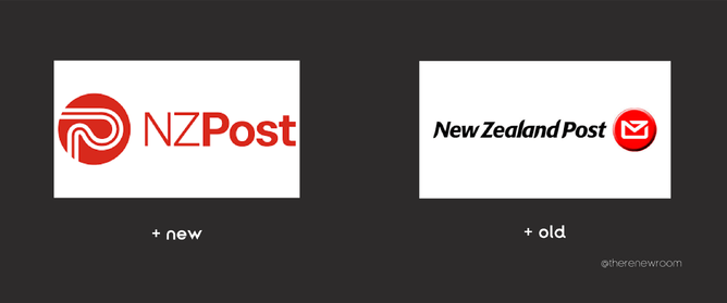
We personally love the new logo. It has a much more modern look and feel as opposed to the old version which is slightly outdated. While the original icon of an envelope does fit the "postal service" offering, the new & improved icon is current and a sign of moving with the times.
NZ Post have come out and said that the new logo is to “symbolise roads, tracks and networks - representing connectivity and efficiency.”
The Font / Typography
The original font was pretty outdated - some of the lines in the different letters had a flick on them and some didn't.
The new font, on the other hand, is clear, bold & easy on the eye. They have made the decision to shorten New Zealand to NZ. It just isn't necessary or important for brand recognition to have New Zealand over NZ - especially when NZ is the common shortening of our country's name.
By making it "NZ" it also meant that the logo / name can now appear bigger on all branding! Smart!
Investment
Now this is going to blow your mind.
15 million dollars is being spent on this rebrand.
There are a lot of things to think about when rebranding a big business such as NZ Post. The digital presence is an easy swap out - it's a click of a button. But all of the print collateral, their storefronts, and not to mention all of their vehicles... that is a HUGE job!
And with a huge job, comes a large investment, but one that is extremely beneficial. It’s also taking around 3 years to fully be implemented because this is the most cost effective way for the business to achieve this and to maintain brand awareness.
What an absolute amazing rebrand by this business.
It opens NZ Post for huge potential business growth and The Renew Room is HERE for it!
This is a big scale business, tackling a HUGE job but it’s great to see that they understand the power of a rebrand. If NZ Post can invest $15million into it... why can't smaller and medium companies do the same? (and with a lot less money!)
We (The Renew Room) are undergoing a little transformation of our own

We say ‘undergoing’ because rebranding is not instant. There is a lot of behind the scenes work that goes into something like this… even for a small business.

Not even 2 years old, The Renew Room was ready for a refresh. But why?
After working with a lot of brands, whether they were completely new companies, or existing businesses wanting a refresh themselves - along with the knowledge we have from working in the industry - we understand the importance of keeping your company fresh.
We wanted The Renew Room to have a more vibrant, updated feel that really showed off our bright personalities. We are forever changing & growing, personally and professionally, and a new colour palette blew a breath of fresh air into us.
A re-brand isn't just about how others perceive you - customers, clients, the public - it is about how we see ourselves. Not only has the rebrand increased our engagement externally, it has also boosted morale within our team... and that is a result in itself!
It's made our processes more effective
With the excitement of the new brand, we updated our OWN collateral. We're usually just focusing on all of our client's businesses! We are all excited, on board and absolutely love our new vibe. (And hope you do too!)
Working for a company that you personally align with is HUGE. It’s more than the actual work itself. It brings enjoyment into your work world - and some companies don’t even know that it’s needed.
Font - out with the old & in with the renew
Even though we all did love our old branding, we definitely outgrew it. The font, was starting to feel dated. The new clean look is exactly what we were after. We send out a lot of content on a day to day basis and wanted our heading and title font to feel cleaner and be more straight to the point - so our body text, became our header text also!
Colour shake up!

The shape of our icon in our logo itself hasn’t changed, but the colour has. Goodbye rusty orange #BO6428 - HELLO fun purple #CEB6E6 ! Pretty much a complete 180 colour change… but but it was a calculated choice!
We kept another, brighter shade of orange in our full brand colour palette - as it is a very bold and energizing choice. But the purple is a little more "us". It is unconventional, a little calming and balanced. It portrays more of a lighter feel - and we definitely feel when we interact with clients from the get go, we have a more relaxed approach.
This hasn’t been a 15 million dollar rebrand
This is something that can be affordable to ANY business. Prioritise what is necessary for your business as a whole. For your staff. For your clients. For YOU!
The power of the rebrand is more than just what you see… it’s what you feel. It’s external, it’s internal. It’s all of these things.
If you want a conversation with someone about how to rebrand… who you gonna call? It ain’t ghostbusters. Let The Renew Room, Renew You!